breakwell
I originally hoped it would be a water intake tracker but...
User research uncovered that participants encountered a more holistic problem and weren’t finding the time to adequate breaks throughout the day to support health habits like drinking enough water, eating snacks, taking regular trips to the bathroom, or making time for the benefits of exercise.

How it came to help instead.
Breakwell seeks to help users solve their problems with insufficient water intake (and a few problems others too!) by providing them with an easy-to-use platform for setting up specific break tasks, goals, scheduling breaks, monitoring their daily progress via an at-a-glance dashboard, and accessing health-related tips and articles.
The research changed my plans.
User Interviews. I did 5 of those. People are busy. But they still have health goals.
Contextual Inquiry. I went to a workplace with a structured break schedule. It confirmed my hunch. People drank more water when they took breaks!

How might we encourage people to take more frequent breaks?
If we’d like to explore ways to help busy people take more frequent breaks to support their water intake and health goals...
How might we encourage people to take more frequent breaks?
But first, who are “those people?”
(Do you feel thirsty yet? Maybe you could be one of breakwell’s users too!)
Breakwell’s users are busy people.
They’re mostly tech-savvy working professionals with health goals who can be found running from one meeting or extracurricular activity to the next. Eat, sleep, repeat. Breaks in their day were desperately needed.

Competitors. There wasn’t anything exactly like breakwell already in existence.
I investigated these hydration tracking apps.

Waterllama

Water Time

Waterlogged
Strengths:
They tracked water well. Sometimes other drinks and beverages. There were some really cute interfaces with gamification, too. We’re looking at you, Waterllama.
Weaknesses:
Cost. Lack of compatibility with certain phone types. No option to sync with calendars. And the focus was on water intake only.

What did I think users would find useful? And in what order?
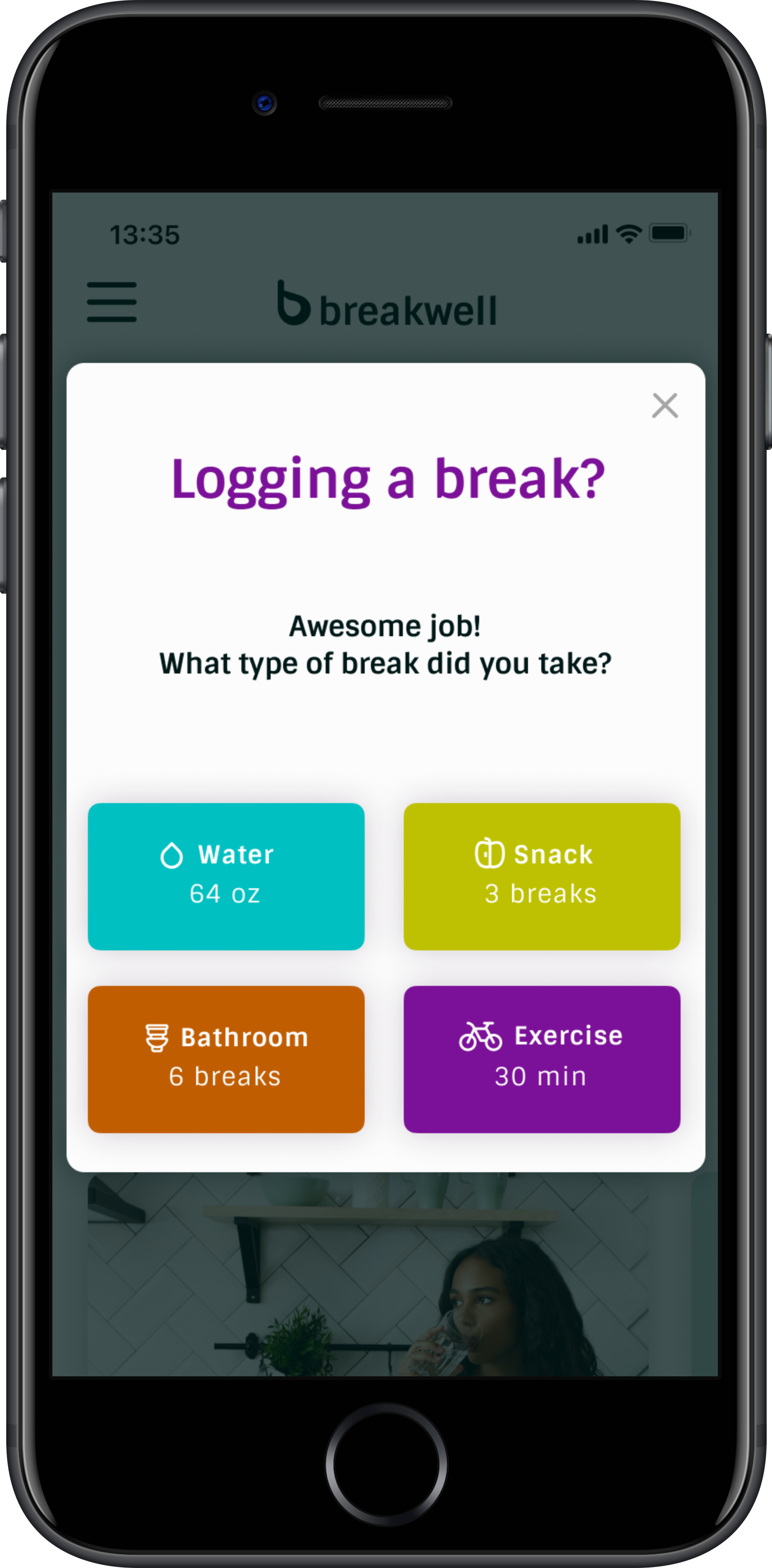
Based on the research, I could have gotten carried away with a wide range of features. I chose to focus on these types of breaks:
Water
Snack
Bathroom
Exercise
And I made sure this aligned with the pain points, behaviours, preferences, and ideas users shared in their interviews...

And the information architecture exercise they did for breakwell.
They sorted a lot of cards.
(Too many cards. I will use less cards next time.)

Then I researched some more.
Creating the right design pattern for the breakwell dashboard was important since there wasn’t anything else like breakwell out there. Simplicity, accessibility, and ease of use were key.

I was tired. But inspired. So I got to sketching.
A lot of the elements from these low-fi wireframes made the cut. Some did not and I wish them well.
The individual screens started to take form with a little more design pattern research to achieve the best starting point for the mid-fidelity designs.

Getting the mood just right was important since our users have an esthetic eye.

Breakwell’s values and style.

And a logo, too.
I chose a modern approach with a nod to hydration, of course.

Components needed to be simple and accessible.
breakwell should be usable and recognizable by anyone, at any time.

The prototype focused on three main tasks during usability testing:
Setting up a new user profile
Logging a water break
Viewing and understanding the dashboard
Here are what the usability test metrics had to say.
All users completed all of the tasks.
There were only minor errors and confusion surrounding the water logging feature.
Overall satisfaction was 4.7/5.
Breakwell users are thoughtful and I am incredibly grateful for all of their feedback during usability testing.
In the essence of focusing on the highest value changes using the least amount of resources (time, precious time), I chose to iterate on the following parts of the prototype.
Added a “Previous” button to the onboarding screens.
It was important to give the users the choice to go back review and/or make changes to their information.

Darkened and boldened the instructions on the water bottle.
Users felt that the instructions needed to be called out more.
Added volume indicators on the water bottle.
Users needed a frame of reference when logging a water entry.

Adjusted the break time window to show peak daytime hours.
Users were struggling with the lengthy scroll to the CTA buttons at the bottom of the frame.
Set default break times that were more realistic.
It’s important that users can relate to the options that are presented to them.

The outcome of this first project exceeded users’ expectations in the clarity of the design and in how it solved a very real-world problem.
Because there wasn’t a dashboard like this one already in existence, it was important that I keep the design simple to highlight breakwell’s utility. Users responded well to my decisions and were excited to test the product. Based on feedback, future steps could include gamification and a social community to increase engagement through competition. There could also be an export feature to provide data for clinical use, which could help gain medical professional buy-in and increase user confidence.

