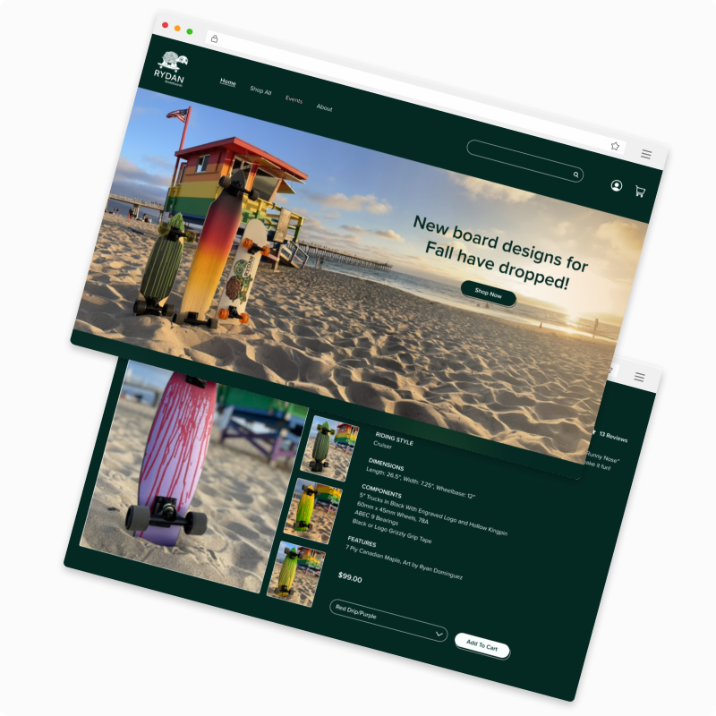
Rydan Skateboards
It was a classic scenario for a small business.
Rydan Skateboards was relying on their social media accounts to generate not only brand engagement but also sales.
They didn’t have a website.
I loved their made-to-order handmade old school cruisers with a new school feel and knew I could help out by creating a slick and simple responsive e-commerce website for them.
Constraints:
• We were limited to 80 hours (or 4 weeks)
• Very little existing content, therefore we’d have to work with Rydan to create some copy and maximize the existing social media content
• No budget for product photography, so we collaborated and rolled that into our hours as well
Tools used:
Figma
iPhone camera
Zoom
To start, I analyzed some leaders in the cruiser category of skateboards.
Land Yachtz
Sector 9
Penny Australia
Strengths:
• All of these companies’ websites used beautiful and on-trend skateboarding photography and/or videography which were laid out into easily recognizable design patterns.
• Bold colours were well contrasted.
• Shopping and checkout related tasks were simple and straightforward.
Weaknesses:
• Some websites had a lot of content to scroll through before arriving at a product listing on product-related pages.
• No assistive technologies were available.
• Only cis-genders were represented.
• Younger or older riders were not present on the website either.
I knew from the competition that diversity and representation would be important factors to explore. I tried to capture these perspectives during user interviews.
Although I didn’t achieve the broad diversity we had hoped for in our synchronous user interviews, I did speak to an equal number of men and women, 25% of which were non-white. Their ages also spanned from mid-20s to mid-50s.
From the real conversations I had with the participating users, some themes emerged:
• Skateboarders need brand familiarity in order to feel comfortable supporting a brand and buying its products.
• Skateboarders need enough information and education about a board in order to be able to confidently make a purchase online.
• Skateboarders want an easy online shopping experience.
• Skateboarders who buy boards online like to know where their order is, every step of the way.
Therefore, I asked myself some important questions based on these insights:
• How might we create brand familiarity amongst the skateboarding community?
• How might we provide just enough visual and written detail to increase buyer confidence when buying a skateboard online?
• How might we make buying a skateboard online as easy as possible while growing brand familiarity and making the buying experience as simple as possible?
• How might we provide thorough and personalized communication throughout the customer journey to ease customer anxiety about their order status?
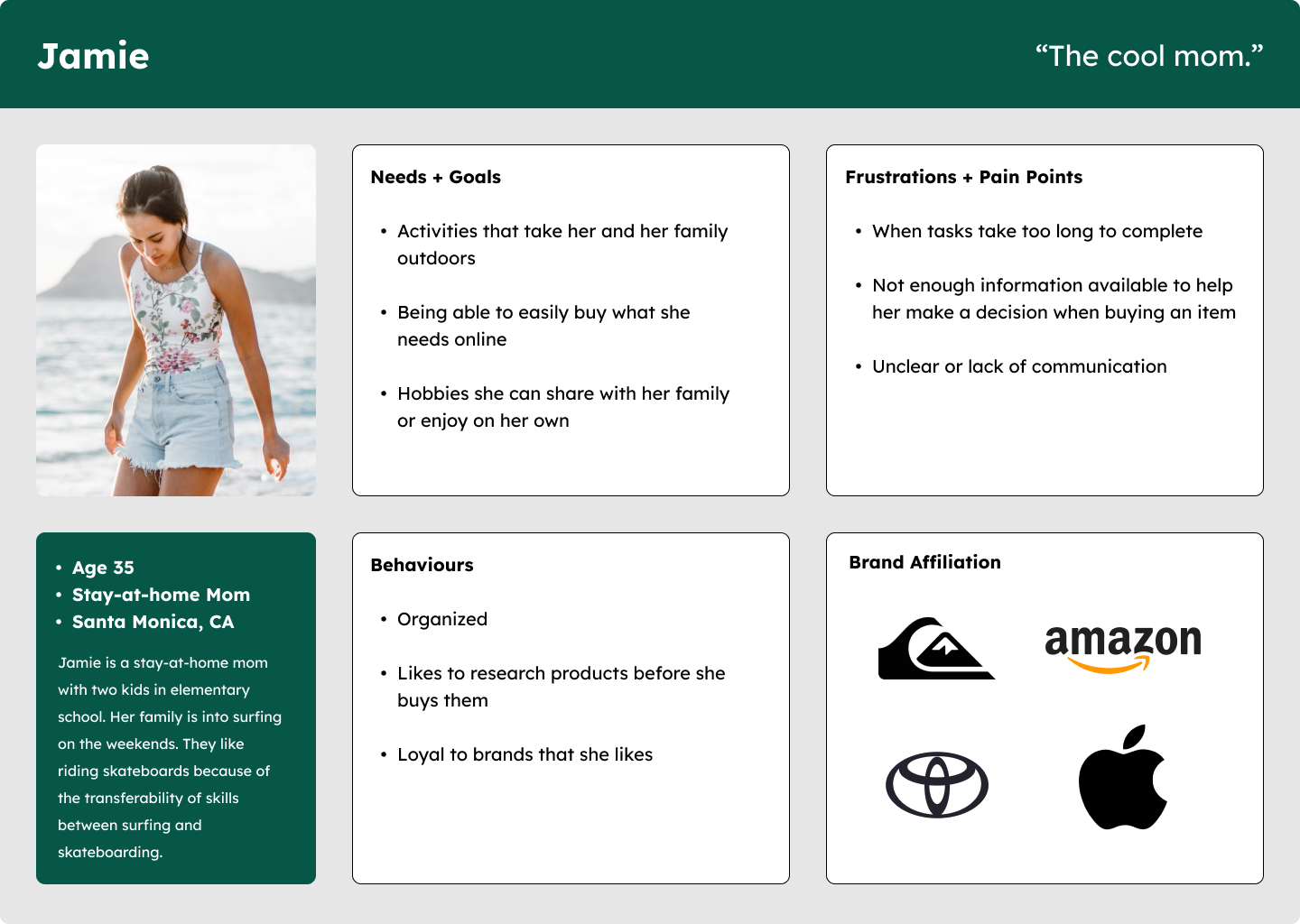
To begin to problem-solve for these questions and to seize the opportunities noted through competitive analysis, I developed two personas for Rydan Skateboards.
What I distilled from
the research.
The personas for Rydan Skateboards reflect the age range, gender diversity, and lifestyles of their users. Although the personas are different, they both seek simple and fulfilling brand and e-commerce experiences when it comes to buying a board. They value work/life integration where they work hard and enjoy that sweet 4-wheels-on-the-concrete lifestyle. Whether they are suburban or beach dwellers with skateboarding skills that transfer over to skate parks or surfboards, they seek an unpretentious experience from a brand that cares about its community, and with enough technical and logistical details about its products to make an informed buying decision.
Onwards to branding!
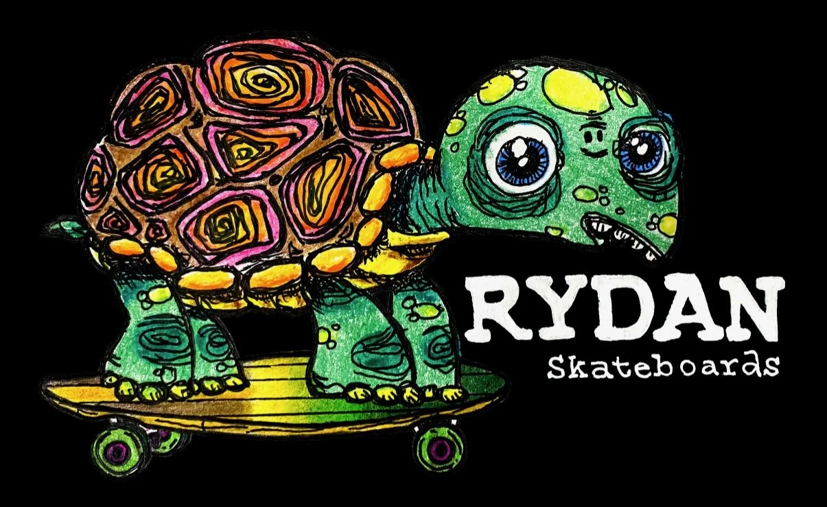
Original Logo
Drawn by the owner,
a talented pencil artist.
New Vector Logo
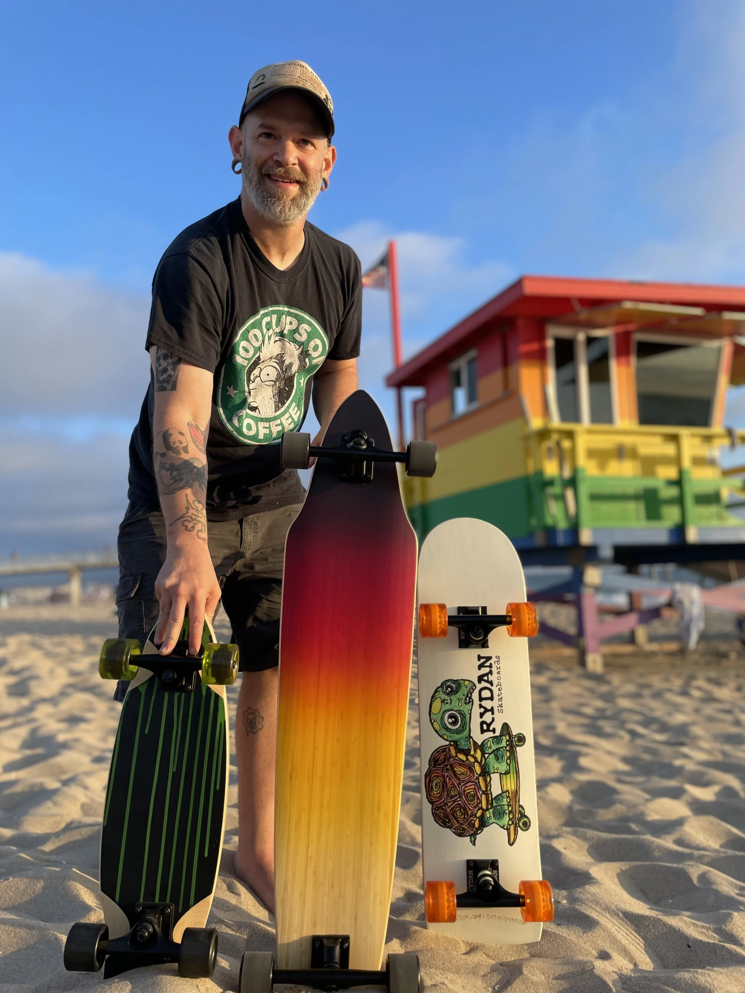
After conferring with the client and discussing the use of their existing logo and imagery, I decided to vectorize the existing logo to make it usable in a variety of branding and marketing applications, planned and executed a photoshoot of the products, and chose brand colours for the website. The original pencil-drawn logo was too good to pass up therefore we decided we’d keep it for apparel and swag to speak to the brand’s origin and to showcase the owner’s many talents.
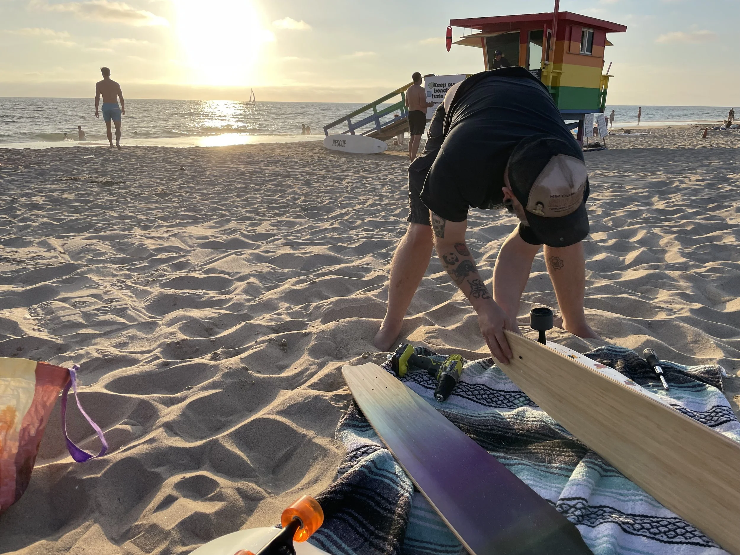
Ryan, owner of Rydan Skateboards, setting up for our product photoshoot on Hermosa Beach, CA.
To plan the information architecture and which elements or features would be best prioritized for a great overall e-commerce experience, I created a simple site map and fleshed out a few task flows that would be key for users:
• Checkout Task Flow (Shop Pay fast pay option)
• Checkout Task Flow (form fields option)
• Order History + Tracking
Site Map
Task Flows
I based my decisions on the feedback from user research interviews and combined that with a recognizable desktop design pattern.
Lo-Fi Wireframes
Low-fidelity wireframes only show a piece of the story and I explained to the client that these are to show basic placeholder elements, desktop website structure, and that I would be layering in the art in the next step if everything was to his liking. And it was! So I got started on the high-fidelity wireframes.
Hi-Fi Wireframes v2
Once the high-fidelity desktop wireframes were iterated upon and then approved, I generated a prototype and performed usability testing.
We prioritized testing flows that are key to the success of an e-commerce experience, based on user research and business goals. The flows we tested with the prototype were:
• Locating and adding a product to the cart
• Removing an item from the cart
• Going through the checkout process as a new customer (using form fields)
Some success metrics for all of our readers who love success. And metrics!
Completion Rate: 100% of tasks were completed
Error Rates: 0 for all tasks
Time On Task:
Locating and Adding a Product to the Cart = 2.5 minutes (average)
Some users browsed the website before performing the purchasing-related task
Removing an Item From the Cart = 17 seconds (average)
Going Through the Checkout Process as a New Customer = 3 minutes (average)
User Satisfaction (Out of a score of 5):
Locating and Adding a Product to the Cart = 4.75
Removing an Item From the Cart = 4.75
Going Through the Checkout Process as a New Customer = 4.75
Our awesome testers loved the simplicity and ease of use of the design and only wanted to see a few missing features which we prioritized in the iterations that followed:
• Added "Continue Shopping" text link to the cart with items
• Added an origin story slice to the "Shop All" and product listing pages
• Adjusted the text hierarchy on the order confirmation page
• Changed “Account > History” to a text link on order confirmation page
• Applied the same origin story and footer changes to the mobile screens
Hi-Fi Responsive Mobile Wireframes
I also made a few small tweaks to the visual design.
Added auroras to the Instagram feed section to create a more dynamic background
Darkened the footers to blend them and ultimately adjust their hierarchy within the overall design of the frame
Applied these changes to the mobile screens as well
Ultimately, we worked hard and had a lot of fun developing this project with Rydan Skateboards.
From assisting with prepping boards for golden hour photo shoots, interviewing skateboarders on the Hermosa Beach pier, to celebratory drinks at a beach pub, and hanging out with our prototype testers for synchronous testing, it was a super fun rollercoaster ride of a responsive e-commerce website project and I can’t wait to do it again with my next client.
And I look forward to the website going live in the coming months!

