Lastix
Have you ever wondered what happens to unsold event tickets? Have you ever made plans to go see a movie, concert, or sporting event at the last-minute?
Would you be more easily convinced to attend one of those events if the last-minute tickets were discounted? I hypothesized that entertainment venues could increase the number of guests and boost sales of goods and services sold on site (concessions, merch, etc…) if people were given the option to attend a movie, concert, or sporting event at the last minute by being offered discounted tickets.

Constraints:
• I was limited to 80 hours (or 4 weeks)
• No existing content or exact business model, therefore I’d have to put on my creative and analytical thinking cap on to develop a solution that users love to use
Tools used:
Figma
Stock photography
Google Meet
The competition didn’t really exist.
Were there organizations and products that are already successfully in the business of selling tickets? Yes, albeit with a lot of frustration from users.
I researched the following ticket sellers:
Ticketmaster
AMC Theatres
Eventbrite
Strengths:
• Brand recognition and established business models
• User familiarity with their product/service
• An abundance of events to choose from
Weaknesses:
• Dynamic pricing which capitalizes on demand (good for business) but very frustrating for users
• Ticket fees that are sometimes 30% of the face value of the ticket
• Servers that crash causing user ticket queues to be lost and reset
• Not selling off unsold tickets or seats to fill venues and maximize profits for the artist/movie/venue/event promoter
Ticket fees and fast and reliable checkout flows were amongst the top pain points for users. I felt that if I prioritized improving on these features, I could add value to the product in addition to the unique last-minute deals.

When interviewing users, the following themes emerged:
• All event information and fees should be transparent;
• Users are frustrated with the high cost of ticket fees;
• Ticket buyers are looking for added value through faster and more reliable checkout flows.
Therefore, I asked ourselves some important questions based on these insights:
• How might we display all event and ticket information transparently?
• How might we add value to an experience aside from offering a discount on last-minute tickets?
• How might we make the ticket buying experience as fast and efficient as possible?
To help focus my efforts on the correct demographic, I was able to develop the following two personas using the data from user research:


The essence that I distilled from the overall situation.
The personas for Lastix are budget-savvy but fun-loving people who enjoy finding time to seek entertainment outside of home. However, they have yet to find a platform that allows them to feel good about their ticket purchases; whether it’s the ticket price, the fees, or the overall technical journey of buying and paying for the tickets, they wish for a product that would ease all of this friction.
Branding was next.
I explored the familiar feel of the classic admission ticket, back before the days of convenience fees and ticket queues that froze and crashed. The transaction was simple, fast, and reliable. Hand over cash, receive ticket, proceed to event. Easy. The typeface that I chose for the logo reflects modernity as a nod to the technology it represents.
Lastix logo
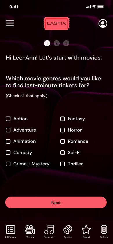
Developing the information architecture meant looking at the event categories as well as the familiar ticket app tools that our users are comfortable with based on design pattern recognition. And to ensure that I stayed within a reasonable amount of features, I developed a simple user flow to prioritize the key frames for the overall experience.

I drew a few sketches to start to envision the design. I didn’t spend too much time here as I was sure of the key components that should be included and tested. High-fidelity wireframes were kept to their key components. I wanted to set myself apart from the competition who favour busier hero sections with a lot of carousels and lists. Lastix is meant to be a fast and efficient experience. Tickets can be limited. And timing can be of the essence. Therefore the event and ticket information needs to be clear, accessible, and readily available.


The flows that we tested once the prototype was created were the following:
• Setting location to view local events;
• Buying a ticket;
• Setting up preferences.
And the success metrics as a results of usability testing:
• Completion Rate: 100% of tasks were completed
• Error Rates: 0 for all tasks
• Time On Task:
- Setting Location To View Local Events = 21 seconds (average)
- Buying a Ticket = 1.7 minutes (average)
• One user wanted to gather more event info before buying the ticket
- Setting Up Account Preferences = 1.2 minutes (average)
• User Satisfaction (Out of a score of 5):
- Setting Location To View Local Events = 4.75
- Buying a Ticket = 4.75
- Setting Up Account Preferences = 4.75
Overall, the folks who performed our usability testing enjoyed the clear, fast, and efficient ticket-buying process with Lastix.
That being said, there are always things to improve upon:
Made the sign in modal copy more specific to be less confusing with the payment modal

Version 1

Current version
Added seat selection charts for seated events

Made the onboarding modal copy more specific to eliminate confusion about the question/task

Version 1

Current version
Added a celebratory confirmation to the ticket confirmation screen

Some of the modals also received a small visual tweak. I made them more consistent with the look and feel of the logo.
Version 1
Current version
Finally, I bundled all of the Lastix components into a UI kit:

Lastix UI kit
Looking back on this project from the start, I’m grateful for the input and feedback from our users which made the research process thorough and expedient so that we could begin designing a product that they (ideally!) find useful. And it seems that they did! We went over our project timeline by one week but I knew I was working with an aggressive timeline from the start. Further exploration of the business implications of actually acquiring tickets from venues, hosts, and organizers to discount and sell at the last minute would be another necessary consideration in the development of this product in the future.
It felt amazing to hear the users say, “I would definitely use this!” and that some of the risks I took with the vision, like having the onboarding screens at the end, made sense to most users and were ultimately appreciated. The research validates that I created an easy and useful product and although I spent a bit more time than originally planned, I achieved my initial goal of a usable Minimum Viable Product (MVP) for an end-to-end app.

Features to consider in the future:
• A distance radius setting for more localized events;
• Adding a filter by time for users to be able to focus on events that align with their availability that day;
• Adding a “If you like [band/entertainer/sports team] then you might also like…” for up-and-coming acts
• Adding a “Save + Exit” feature for the onboarding screens.
